
As you’ve certainly seen a few days ago, Burberry has unveiled a new brand identity. This follows the arrival of Riccardo Tisci, its latest Creative Director, in early 2018.
Since then, reactions have been mixed to say the least. While the fashion press carefully stuck to describing the new look, social media, including both consumers and professionals, widely panned it.
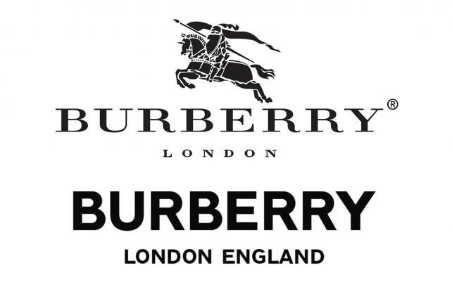
Actually, it seems absolutely no one is impressed with the maison’s new logo. And it’s true that, at first glance, it looks pretty bland with its bold sans serif letters and absence of the century-old “Equestrian knight” emblem.
Many have rightly pointed out that Burberry is the latest luxury brand to hop on the minimalistic logo bandwagon, a trend that started six years ago with the already controversial — yet highly successful — Saint Laurent renaming, and recently embodied by Calvin Klein’s and Rimowa’s new identities…
I don’t consider myself enough of an expert in graphic design to judge this work but I’m not going to argue that altogether ditching a globally-recognized font and an emblem that has stood for British refinement for decades is not a risky move. It is a real long shot.
However, I find the rage around this change disproportionate, especially coming from the communications industry. Adweek compared it to the infamous Gap logo reshuffle and some described it as nothing other than brand suicide. Yet another sign of an upcoming marketing apocalypse!
Going beyond the logo
We could look beyond the logo choice and use a little more reason to see the bigger picture. Actually, and whatever its fate, this redesign tells us a lot about the current state of the Luxury industry.
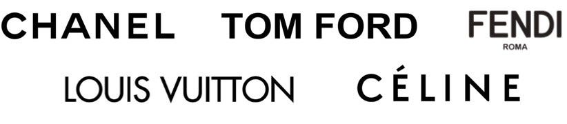
First, it’s not like minimalistic sans serif logos are a new thing in fashion. Take Louis Vuitton, Céline, Tom Ford, Fendi or Chanel. Nothing but in-your-face simplicity.
I know what you’ll answer: most of these maisons also have strong, well-known monograms. True, but they seldom integrate them as standalone emblems in advertising or communications (just go to the Chanel website and look for the double-C — it’s virtually nowhere). They’re more often used as patterns or ex libris. Moreover, what makes one think the beloved Burberry Knight will not come back in other forms?
Of course, all luxury maisons falling for minimalism carries a major risk of uniformity. However, distinctiveness comes in all shapes and the Burberry redesign goes beyond that underwhelming logo.
In fact, those moaning solely at the sole logo are missing two significant points.
Celebrating legacy through collaboration
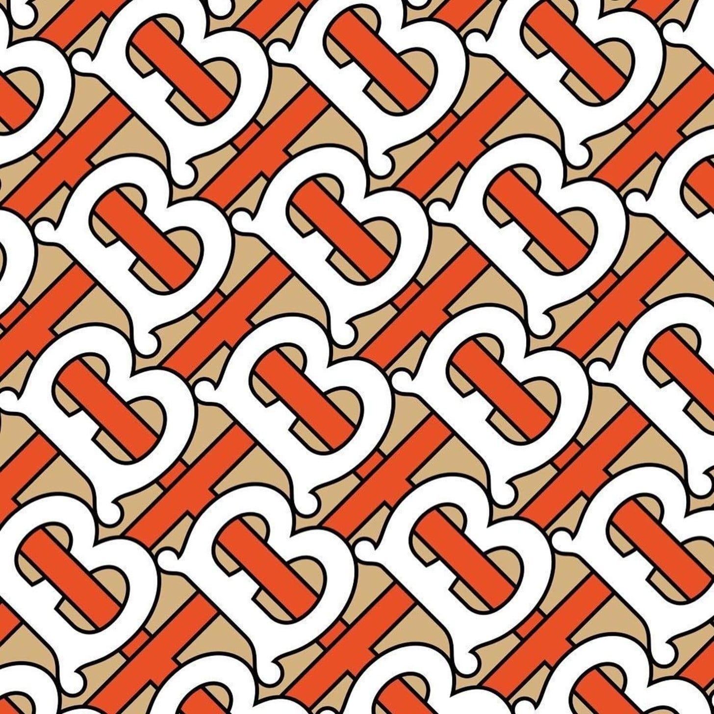
The first one is the colorful monogram which was revealed alongside it. If Tisci killed the old Burberry identity, he also revived an existing pattern created in 1908 featuring interlocked Ts & Bs (for Thomas Burberry). It’s a bold way to distance oneself from the maison’s well-known but hackneyed tartan pattern without relinquishing its legacy.
The second point, and the most important one, is the creative process behind the redesign. The logo and the accompanying pattern were not made only in house. The work was supervised by Peter Saville’s studio.
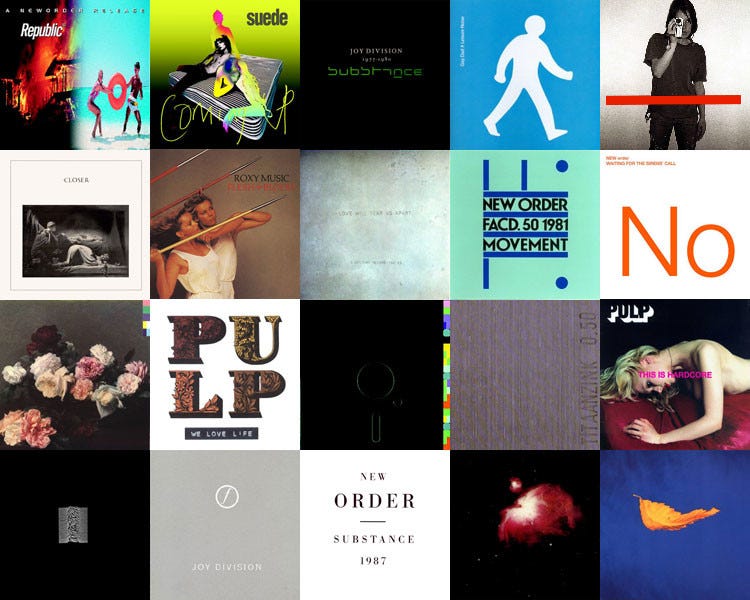
Peter Saville is one of the most influential designers of the last 40 years, especially thanks to his work for the Factory record label and bands such as Joy Division and New Order. He repeatedly collaborated with fashion labels and regularly works with Raf Simons, with whom he revised the Calvin Klein logo last year (without any fuss, mind you). Asking Peter Saville, a British superstar of minimalistic design, to take on an old British lady such as Burberry was highly symbolic.
Therefore, the collaboration in itself is really what matters here. The whole process was displayed through shots of emails exchanges between Tisci and Saville published on Instagram. This screenshot aesthetic, in which e-mail or messaging exchanges are reproduced in a candid way, is a byproduct of Internet culture. Using it is also very symbolic: it highlights — though in a staged manner — the back and forth creative process, showing how even one the most iconic luxury brands evolves from the inside.
Burberry has already encountered many ups and downs through its 162-year life. When Riccardo Tisci was appointed in March, his mission was made clear: 1) renew the maison’s public and 2) make it even more upscale. The new CD is now striving to shake things up the hard way. For instance, he announced a few weeks ago that the brand would adopt a “drop” selling strategy much like niche streetwear brands. To that extent, the old Burberry logo and the famed tartan pattern were probably deemed too traditional and had to be replaced.
Some will argue that Tisci’s approach is just a pot-pourri of everything that’s been successful in luxury recently — a bit of Gucci, a hint of Supreme, a drop of Saint Laurent… Perhaps they will be right. But the Italian Creative Director is certainly no newcomer and his track record at Givenchy is stellar — he transformed the ageing brand, reaching half a billion euros of sales and tripling the number of employees during his tenure. Moreover, he has always been keen on collaborating with other creators, even competitors: he featured Donatella Versace in Givenchy ads and recently worked with Vivienne Westwood for a limited edition collection at Burberry.
To sum it up: only time will tell if the redesign was a mistake or not. But this bold/foolish choice tells us much more about the state of Luxury as a whole.
On the one hand, we can see maisons have not relinquished their prestigious past at all. They are still torn apart between their legacy and the urge for modernity to conquer new clients. Hence Burberry’s balance between the new TB monogram (modernised heritage) and the logo (a clear tabula rasa).
On the second hand, Luxury is more than ever heavily dependent on collaborations and (that’s the new thing) it is not afraid to show it anymore. For many maisons, the current period marks the end of the black box model, in which the creative process was sacred and maintained hidden in house. Of course, it doesn’t mean luxury brands are shifting to full transparency, but what we saw with the Saville-led Burberry redesign is an acknowledgment, if not a real celebration, of outside influences.


